NISL introduces new logo identity
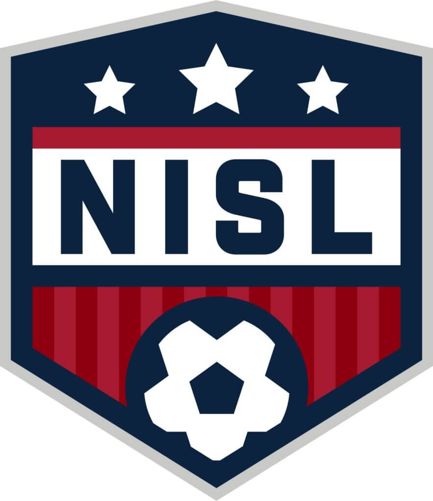
The National Indoor Soccer League (NISL) has revealed its new league logo in anticipation of its third season of competition. This fresh emblem underscores NISL’s distinct commitment to both men’s and women’s professional indoor soccer.
The league’s previous logo featured a silhouette, bearing a resemblance to those of the National Basketball Association (NBA) and Major League Baseball (MLB), and even adopting a similar color scheme. However, as a league that equally highlights male and female athletes, the logo used in the NISL’s initial two seasons failed to embody this hallmark. Unlike the approach taken by the NBA when launching the Women’s National Basketball Association (WNBA), where a separate logo was introduced, NISL leadership aimed to present a unified logo.
Mary Ellen Rogers, NISL President, expressed, “Our entire foundation is built on unity and equality. We intended our new logo to reflect precisely that.” She further elaborated, “Having a single league logo aligns perfectly with our identity, as our teams adhere to the same rules, operational guidelines, and even share game days.”
The updated logo maintains the core color palette of the NISL’s previous logo while discarding the silhouette and shape in favor of a distinctly different look—a crest or shield—bringing it in line with other premier professional sports leagues such as the National Hockey League (NHL), National Football League (NFL), and Major League Soccer (MLS). Additionally, the new design prominently incorporates a soccer ball.
The refreshed NISL logo also integrates three stars placed at the same level and atop the logo. Rogers elaborated, “These three stars symbolize our league and its two divisions. The central, larger star signifies the NISL itself. The equally sized stars on either side represent our Men’s Division and Women’s Division, respectively. The league star, positioned between both divisional stars, signifies unity while acknowledging their separate but equal competition and operation.”
Rogers emphasized, “Ensuring that every facet of our brand encapsulates and celebrates the comprehensive offerings of NISL is pivotal for our league’s growth. Our member teams, athletes, front office personnel, and dedicated fans can now grasp our full identity by simply glimpsing at our logo. This upgraded emblem uplifts and modernizes our brand, and its debut coincides with an exciting juncture as we strive to draw in more fans from existing and future markets to our premier league.”
